欢迎来到相识电子书!
标签:Design
-
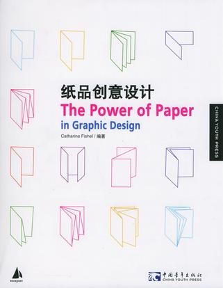
纸品创意设计
尽管CD、DVD和因特网等电子介质发展迅猛,但印刷品设计依然比以往更为丰富、更具挑战性。可以将数字化设计与印刷品区分的惟一设计元素就是:纸。在印制品世界中,纸张的选择深深地影响着每一个设计项目。 本书是一本汇集了世界顶级设计师的最具挑战和影响力的大作,收集的作品富有激情、理念和创新,文字内容更是深入剖析了纸张在设计中的重要性。同时,书中还着重讲述了如何配合作品选择纸品的创意,以及纸品作为表述设计理念的一种手段,充分展示纸品的结构特性和艺术美感。是目前国际上最新的纸品设计权威图书。 《纸品创意设计》集纳了顶级设计师的纸品创意作品;深度分析了纸品的特性,如材质、透明度和光泽;是Rockport最畅销的“纸品设计”图书。 -
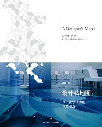
设计私地图
22位全球工业设计师明星的21世纪新设计及新时尚 这是一本学习工业设计、从事杂志编辑采访的设计人及媒体人,多年研究设计、看设计、做设计、写设计后,描绘出来以全球工业设计师为坐标的设计地图;从早已各拥山头的Marc Newson、Droog Design的创立者Gijs Bakker、Marcel Wanders、Jasper Morrison、Stefano Giovannoni,一直到年纪虽轻却早早崭露头角的Ora Ito、Bouroullec Brothers、Tjpe.、吉冈德仁……织就出一张让设计人神往的设计师地图,同时牵引出一篇篇意味浓厚的设计师故事,探讨设计师及其作品背后的设计思考。 -
风格的技术
风格就是这个人本身-Buffon布冯Style is the physiognomy of the mind。风格就是心灵的脸容-Arthur Schopenhauer叔本华风格是企业和个人的一种哲学思考,一种认为「企业、产品、人(顾客、员工、供货商)、自然」之间如何相处的方式。它是一种价值判断,也是一种世界观,决定企业、个人何者该为,而何者不该为。但风格并非僵硬的守成,进步的企业会随时在自己的哲学中,创造新的解释、建立新的态度、更新自己的「脸容」。 而2008年,《风格的技术》问市,詹伟雄走访13位优秀风格企业经营者,进行深度对话、访谈与诘问,探究他们如何凭借个人内在特质,形塑风格企业,创造生意机会,为《美学的经济》读者提供最实用的风格工作技术。这是13篇关于忤逆者幸存在主流丛林中的技术报告。 目录 01 王伟忠 x 詹伟雄:台湾综艺节目创意之王 金星传播 02 包益民 x 詹伟雄:台湾最畅销分众杂志诞生史 PPAPER 03 甘泰来 x 詹伟雄:台湾最有感觉商业空间打造者 齐物设计 04 朱 平 x 詹伟雄:台湾最抒情服务业 肯梦国际 05 安郁茜 x 詹伟雄:台湾最过动设计教育乐园 实践大学设计学院 06 李彦良 x 詹伟雄:台湾最有想象力建设公司 忠泰建设 07 林洲民 x 詹伟雄:台湾最具社会观察力建筑师 仲观建筑事务所 08 林暐哲 x 詹伟雄:台湾最有创造力音乐制作人 林暐哲音乐社 09 郝明义 x 詹伟雄:「郝Style」的出版私房经验 大块出版 10 廖镇汉 x 詹伟雄:台湾最时尚City Mall研发史 微风广场 11 谢荣雅 x 詹伟雄:台湾最传奇工业设计公司 大可意念 12 刘季强 x 詹伟雄:台湾最有个性精品旅馆 台北商旅 13 聂永真 x 詹伟雄:台湾最有流行感平面设计师 永真急制 -
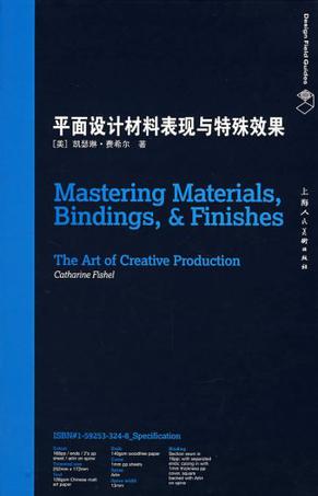
平面设计材料表现与特殊效果
《平面设计材料表现与特殊效果》是一本涉及到数百种处理方式的指导书,并讲述了在你的设计中如何正确运用这些处理方式的相关知识。你将获悉众多设计理念、难点、缺陷,还有那些富有经验的设计者运用那些设计效果的心得体会。 设计者喜欢在他们的设计中融入特别的元素,让设计显得出众。这些特殊处理常常是使得观者与设计产生共鸣的要素。然而,这些特殊的润色成本常常是昂贵的,而且要正确地运用它们也相当困难。 -
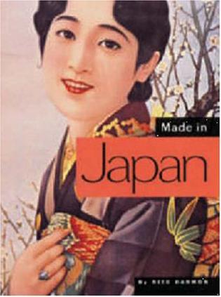
Made in Japan
Made in Japan -- Made in Japan—these three simple words conjure playful wit, a delight in detail, formal elegance, and graphic energy. Author of Made in China, Reed Darmon has collected hundreds of images of everyday Japanese design and pop culture ephemera from the past century. Including perfume ads, art deco matchboxes, robot toys, action movie posters, Noh masks, kimono patters, sumo cards, children's books, household product packages, and much more, the fascinating objects assembled here reveal traditional Japanese artistry and techniques as applied to playfully modern design. A stylish object and graphic essay in one, Made in Japan is an extraordinary glimpse into the heart of Japanese popular culture. -
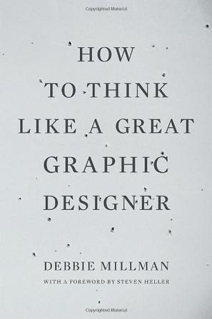
How to Think Like a Great Graphic Designer
Take a peek inside the heads of some of the world’s greatest living graphic designers. How do they think, how do they connect to others, what special skills do they have? In honest and revealing interviews, nineteen designers, including Stefan Sagmeister, Michael Beirut, David Carson, and Milton Glaser, share their approaches, processes, opinions, and thoughts about their work with noted brand designer Debbie Millman. The internet radio talk host of Design Matters, Millman persuades the greatest graphic designers of our time to speak frankly and openly about their work. How to Think Like a Great Graphic Designers offers a rare opportunity to observe and understand the giants of the industry. -------------------------------- Designers interviewed include: Milton Glaser Stefan Sagmeister David Carson Paula Scher Abbott Miler Lucille Tenazas Paul Sahre Emily Oberman and Bonnie Siegler Chip Kidd James Victore Carin Goldberg Michael Bierut Seymour Chwast Jessica Helfand and William Drenttel Steff Geissbuhler John Maeda -
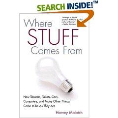
where stuff comes from
No toaster is an island. In fact, as Harvey Molotch demonstrates in this sparkling tour of how things are created, the everyday objects of our life are a delicate and clever intermingling of design, timing and functionality that mirrors contemporary life. Where Stuff Comes From is about paper clips, post-its, bathtubs, cars and all the other stuff in our lives. It is about how these items were imagined into existence and made a part of the American material culture. From the designer to the manufacturer to the business owner to the consumer, Molotch guides us through the worlds of technology, design, corporate culture and popular culture, giving us a sense of how and why we want stuff. He rolls up his sleeves and goes behind the scenes at trade shows and in design studios to speak with the product-makers who gave us the world's best-selling garlic press, the Nike swoosh and Volkswagen's resurrected Beetle. A witty and surprising voyage into the aesthetic unconscious of the consumer, Where Stuff Comes From probes the meaning of the objects in our lives and what our possessions say about us. Ultimately, Molotch opens a fascinating window into our economy, society and culture by unlocking the complex strategies behind simple things. -
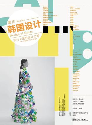
漫步韩国设计
《漫步韩国设计:活力十足的设计之都(全彩)》内容简介:设计,让生活更美好!漫步设计系列,精选世界上设计具有代表性的国家——芬兰、德国、英国、西班牙、巴西、日本、韩国等,通过实地采访,以专业新锐的视角、图文并茂的形式,介绍各个国家、城市的设计状况,网罗国际艺术设计领域的经典案例,包括建筑设计、平面设计、产品设计、室内设计、图形文化等多个设计领域。《漫步韩国设计:活力十足的设计之都(全彩)》以韩国为出发点,通过实地采访,以图文并茂+游记式的文字,让读者全面了解韩国先进的设计理念、独特创意,杰出设计师,设计院校及设计资讯等,让从未到过韩国的读者在轻松的文字中既了解韩国的城市,又了解其设计理念。 -
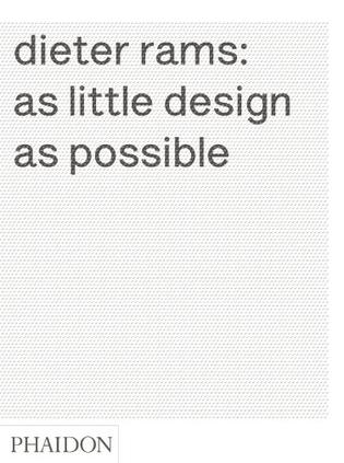
Dieter Rams
Product Description Indifference towards people and the reality in which they live is actually the one and only cardinal sin in design' - Dieter Rams. Dieter Rams' life and work are indelibly linked to his thoughts about how people live, and how they can live better. Products he designed in the 1960s are still being produced and sold today - only one demonstration of the strength of his work. This comprehensive monograph covers both Rams' life and his work, as well as his ideas on good design, which continue to inspire designers and consumers today. A personal foreword by Jonathan Ive evokes the influence that Rams has had on his own work and, by extention, the objects with which so many of us share our everyday lives. An introduction and an essay by Klaus Kemp tell the story of Rams' early life, his training as an architect, and the intellectual context in which his ideas were developed. The next four chapters examine Rams' work and his life - which are more or less synonymous - in depth. This includes his role at Braun as well as the work he did for the furniture company Vitsoe. Each chapter includes sketches, prototypes, finished products and the marketing for those products, giving a complete picture of Rams' work and its context. Two other chapters in this section present Rams' own house, the only work of architecture that he completed, and examine the products he designed at the level of detail, a crucial aspect to his work. A further chapter examines Rams' 'ten commandments' of good design and his credo, 'less but better', in the context of his role as head of design at Braun, and a final chapter explores his legacy in the work of contemporary designers including Naoto Fukasawa, Jonathan Ive, Sam Hecht, and Konstantin Grcic. This beautifully designed book includes a wide variety of visual material, including sketches and technical drawings, photographs of Rams' work as well as his life, archival material from both Braun and Vitsoe, Ingeborg Rams' subtle photographs and Vitsoe's playful graphic design and advertising. This book will appeal not only to fans of Dieter Rams' work, but to everyone drawn to the message behind his 'ten commandments' of good design - which are really ideas about how we can all live better and more sustainable lives. -
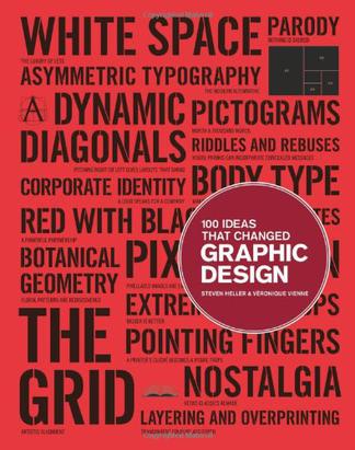
100 Ideas that Changed Graphic Design
Product Dimensions: 10.6 x 8.3 x 0.7 inches New in the "100 Ideas that Changed..." series, this book demonstrates how ideas influenced and defined graphic design, and how those ideas have manifested themselves in objects of design. The 100 entries, arranged broadly in chronological order, range from technical (overprinting, rub-on designs, split fountain); to stylistic (swashes on caps, loud typography, and white space); to objects (dust jackets, design handbooks); and, methods (paper cut-outs, pixelation). Written by one of the world's leading authorities on graphic design and lavishly illustrated, the book is both a great source of inspiration and a provocative record of some of the best examples of graphic design from the last hundred years. -
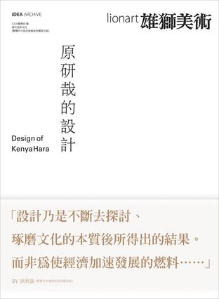
原研哉的設計
日本設計大師原研哉為其設計生涯的諸多作品,以淺顯易懂的精鍊語言,做全面性解說。近年來的新作,如「HAPTIC」展、北京奧運象徵標誌最終設計案等,亦收錄其中。 大開本設計、精美印刷加上嚴選的紙張,促使原研哉作品躍然紙上、風華再現。 收錄原研哉最新長篇訪談。針對過去的作品、現在的工作以及未來的展望,侃侃而談。全篇萬餘字,精采可期。 在「設計者.友人.恩師眼中的原研哉」單元中,收錄了深澤直人、向井周太郎等八位與原研哉有著密切關係的人物,站在客觀的角度,對原研哉其人其作品,各有精采的闡述與分析。 原研哉首度公開,四位對其設計生涯有著深遠影響的設計大師。包括石岡瑛子、向井周太郎、杉浦康平以及永井一正。原研哉自四位大師身上學習到了什麼?文中娓娓道來,發人深省。 原研哉特地為「原研哉的設計-繁體中文版」在台灣的出版,撰寫了「促使世界更新之力量」一文。為序,也為其目前對設計、對世界情勢最深切的關心。 -
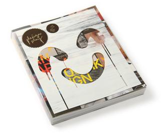
Design • Play
Games and tricks often breed big ideas, and the idea of ‘Play’ has prompted artists and designers to bring peculiarity into the routine and amuse the bored with visual tricks and interactive designs. Be it simple or complicated, deliberate or unintentional, this art of spreading joy demands a strong commitment to break the rules and a knack of poking fun in a lighthearted way. From mimicries to interactive approaches that engage users in the development of desirable design outcomes, Design•Play put together a rich source of playful ideas that challenge your normative perceptions by means of five distinctive kinds of 'Play' embraced in graphic, product and spatial designs. Further evidence of the omnipresence of the uncompromising attitude with Design•Play snapshot campaign – Let Eyes and Brains Play, enjoy the best 100 first-hand eye tricks experienced by a cluster of fun-loving mortals from around the world! -
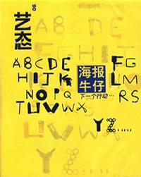
海报牛仔-下一个行动
《艺态6:海报牛仔》告诉读者黑与白元素的使用,实际上是对于建筑学中一种强烈色彩对比的视觉暗示,两元对立性是设计结构的根本所在。《海报牛仔》为《艺态》杂志06版,通过个人化的设计规则,表达自己的设计作品,也包括关于设计实用性与美学问题的全盘考虑。 -
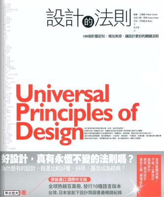
設計的法則
好設計,真有法則可遵循嗎? 為什麼有的設計,就是比較好看、好用, 甚至成為經典? 完整揭露「好設計為什麼好?」的100個祕密。 深入淺出,圖解抽象的設計原理及關鍵的設計法則。 涵蓋平面設計、建築、工業設計、廣告行銷及使用介面設計。 避免致命錯誤,是消費者看懂好設計的必備常識,更是專業設計師作品升級的對策寶典。 為什麼有些設計,就是比較好看、好用、搶眼,而且可信度高;有些則比較難使用、容易被忽略,甚至讓人反感?它們做對了什麼.,又做錯了什麼? 在這本全球設計人士一致好評推薦的書中,無論是設計師、工程師、建築師、廣告行銷、相關領域的學生及工作者,甚至是一個消費者,都可以立刻找到門道,培養出判斷「好設計為什麼好?」的眼光與能力。 不管是舉辦行銷活動、設計海報、籌畫博物館展覽、設計電腦遊戲或甚至更複雜的建築與工業設計,所有從事設計相關的工作者,都在不斷思索同樣的問題: 如何增加視覺吸引力、如何增強功能並方便使用、如何影響使用者的認知、 如何增加設計的美感,以及如何做出最好的設計決定。 困難的是,設計跨足了不同領域的專業知識,過程中還牽涉許多複雜的操作。本書是第一本跨越各專業領域的設計書。書中列出了100個放諸四海皆準的設計法則,從「80/20法則」(80/20 rule)、「意元集組」(chunking)、「娃娃臉偏見」(baby-face bias)、「奧卡姆剃刀」(Ockham’s Razor)、「自相似性」(self-similarity)到「說故事」(storytelling)……,從這些法則中,你可以快速地吸收寶貴經驗,避免犯錯,開啟更多靈感與創意。 例如: 「外觀較美的設計,會被認為比不美的設計更好用。」 「腰到臀比例是決定男女迷不迷人的主要因素。」 「看到有魅力的人,會認為他們比普通人更聰明、能幹有道德,以及可親。」 「在設計角色或產品時,如果需要明顯的五官特性,就要考慮人們的娃娃臉偏見。」 「人們傾向偏愛大草原般的環境,而較不喜歡如沙漠、山脈等簡單的自然景觀。」 「所有的產品會相繼走過四個階段:發表、成長、成熟、衰退。」 「複雜的行為很難教會。最好分解成小一點、簡單一點的副行為,然後一個一個的教。」 ■本書目錄 1.80/20 rule 80/20規則 2.Accessibility 容易使用 3.Advance Organizer前導手冊 4.Aesthetic-Usability Effect美就是好用的效果 5.Affordance 功能可見性 6.Alignment 對齊 7.Archetypes 原型 8.Attractiveness Bias 魅力偏見 9.Baby-Face Bias 娃娃臉偏見 10.Chunking 意元集組 11.Classical Conditioning 古典制約 12.Closure 閉和 13.Cognitive Dissonance 認知失調 14.Color 顏色 15.Common Fate共同命運 16.Comparison 比較 17.Confirmation 確認 18.Consistency 一致性 19.Constancy 恆常性 20.Constraint 約束 21.Control控制 22.Convergence聚合 23.Cost-Benefit成本效益 24.Defensible Space 可防衛空間 25.Depth of Processing 處理深度 26.Development Cycle 開發週期 27.Entry Point 進入點 28.Errors 錯誤 29.Expectation Effect預期效應 30.Exposure Effect 曝光效應 31.Face-ism Ratio臉部主義比率 32.Factor of Safety 安全因素 33.Feedback Loop反饋循環 34.Fibonacci Sequence 費布那西數列 35.Figure-Ground Relationship 形象-背景關係 36.Fitts’ Law 費茨法則 37.Five Hat Racks五帽架 38.Flexibility-Usability Tradeoff 彈性-使用性替換 39.Forgiveness 寬恕性 40.Form Follows Function 形式追隨功能 41.Framing 框架 42.Garbage In-Garbage Out 垃圾進、垃圾出 43.Golden Ratio 黃金比例 44.Good Continuation 連續律 45.Gutenberg Diagram 古騰堡圖表 46.Hick’s Law 席克法則 47.Hierarchy 層次 48.Hierarchy of Needs 需要的等級 49.Highlighting 強調手法 50.Iconic Representation 圖象表徵 51.Immersion 專心一制 52.Interference Effect 干擾效應 53.Inverted Pyramid倒金字塔 54.Iteration 重複 55.Law of Pragnanz 布拉哥南斯律 56.Layering 分層法 57.Legibility 容易識別 58.Life Cycle 產品週期 59.Mapping 映射 60.Mental Model 心智模型 61.Mimicry 模擬 62.Mnemonic Device 記憶技巧 63.Modularity 模組化 64.Most Average Facial Appearance Effect 最平均臉型效果 65.Normal Distribution 常態分配 66.Ockham’s Razor 奧卡姆剃刀 67.Operant Conditioning 操作制約 68.Orientation Sensitivity 定位感 69.Performance Load 效能負載力 70.Performance Versus Preference表現對上偏愛 71.Picture Superiority Effect 圖優效果 72.Progressive Disclosure 進階展開 73.Prospect-Refuge 全貌-庇護 74.Prototyping 雛型設計 75.Proximity 接近 76.Readability可讀性 77.Recognition Over Recall 辨認比回想重要 78.Redundancy 候補 79.Rule of Thirds 三分定律 80.Satisficing 滿意法 81.Savanna Preference 大草原偏愛 82.Scaling Fallacy 規模的謬誤 83.Self-Similarity 自相似性 84.Serial Position Effects 序列位置效果 85.Shaping塑造 86.Signal-to-Noise Ration信噪比 87.Similarity 相似性 88.Storytelling 說故事 89.Structural Forms 結構型態 90.Symmetry對稱 91.Threat Detection 威脅偵測 92.Three-Dimensional Projection三維立體投射 93.Top-Down Lighting Bias由上而下光源偏見 94.Uncertainty Principle測不準原理 95.Uniform Connectedness 均質連結性 96.Visibility 可見性 97.von Restorff Effect 梵雷斯托夫效應 98.Waist-to-Hip Ratio 腰到臀比例 99.Wayfinding 找路 100.Weakest Link 最弱的一環 -
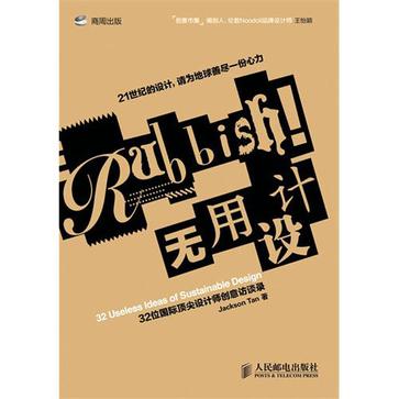
无用设计
《无用设计:32位国际顶尖设计师创意访谈录》内容简介:“无用设计”是一种新的设计理念。它提倡为消费者、社会或世界创造更直接的价值,提倡设计的可持续性。可持续性(Sustalnability)可谓当前全球重要的议题之,设计界也不例外,开始有越来越多人认识到过度设计(overdesign)的状况,用完即丢的消费习性也受到挑战,提倡可持续设计,成了设计界当前重要的趋势。为了地球的可持续未来,这也是消费者应该认识的21世纪重要议题。《无用设计:32位国际顶尖设计师创意访谈录》邀集32位国际顶尖设计师的构想与作品,涵盖了艺术、时尚、平面设计、产品设计、建筑、出版、广告、摄影、网站等不同方面,以“可持续设计”(slastainable Design)为主题,强调设计要能创造出价值;让读者认识到为了创造一个可持续的未来,设计所扮演的角色与发展方向。《无用设计:32位国际顶尖设计师创意访谈录》适合时尚、平面、产品、网页、广告等相关领域的设计师阅读。 点击链接进入新版: 无用设计:32位国际顶尖设计师创意访谈录(修订版) -
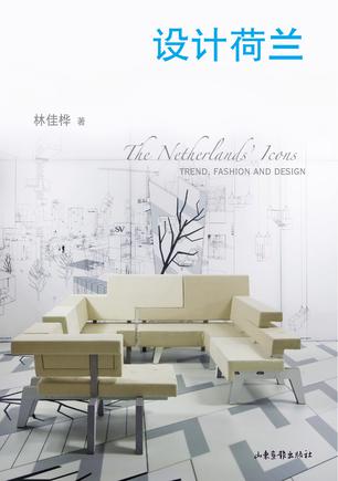
设计荷兰
“荷兰设计的风格语言……荷兰设计向来以创新、前卫、富现代感与别具幽默感,在全球设计界独树一帜。” ——荷兰外贸部长弗兰克•海思克(Frank Heemskerk) “只有依靠设计,我们才能使我们的国家成为一个可以日日生存的地方。” ——荷兰鹿特丹布宁根博物馆馆长、杰出设计师威廉•克罗威尔(William Crosswell) 荷兰是现代主义设计、国际主义风格的故乡。作为伦勃朗和凡高们的后代,荷兰人从不匮乏艺术家气质,但你若回看历史又很容易发觉他们强烈的实践派作风。荷兰设计是二者的融合:朴素实用、谦逊而流露出幽默感。 荷兰设计重视概念、想法和创新手法。荷兰很多设计师会主动推荐值得一看的博物馆、小店,心态开放、团结,欣赏彼此优点。荷兰人真切、直接、不浮夸、不贪心的个性,成就了整个荷兰设计的氛围。 本书介绍了荷兰当地最新流行时尚、新锐设计师,及建筑风格、钻石珠宝、创意市集、杂货小物……让我们了解荷兰人对于艺术的想法、态度和审美观。按图索骥,可以深切地认识这个被誉为世界设计风向标的设计之都。
热门标签
下载排行榜
- 1 梦的解析:最佳译本
- 2 李鸿章全传
- 3 淡定的智慧
- 4 心理操控术
- 5 哈佛口才课
- 6 俗世奇人
- 7 日瓦戈医生
- 8 笑死你的逻辑学
- 9 历史老师没教过的历史
- 10 1分钟和陌生人成为朋友

